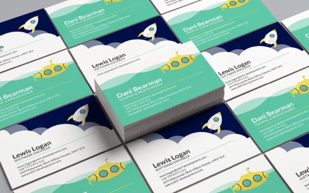
Networking Like a Natural: Designing the Perfect Business Card
There are different types of networking groups, but it’s important that you use them wisely. No matter which type of networking group you go to, your goal is to meet new people and bring in new business and you need to learn to network like a natural.
Part of networking like a natural is knowing what information to put on your business card and how to best design it. Continue reading this article to learn the best tips for creating a business card.

Name & Contact Information
Every good business card template ensures it includes your name and contact information. Make sure you only put the most important contact information on your card, however.
For instance, you don’t need to put every social media profile. If there is a specific way you like people to contact you, you might opt only to put that mode of contact there.
Relevant Image
Some people put photos of themselves on their business cards. This can be helpful if you want to make sure people connect your face with your name.
Some people choose to put an image that relates to their work. For instance, if you’re a bookkeeper, you might put a computer and a filing cabinet on the business card.
Whatever you decide, make sure the photo is crisp and designed to be used for print.
Plenty of Color
You don’t want your business card to look boring. You likely already have your colors picked out for your brand. You should use the colors from your branding since it will help people connect with your brand more.
You don’t have to go overboard, but it is a good idea to at least have a splash of color to get people’s attention. People are attracted to things that are visually appealing, so make sure that describes your business card.
Textured Effects
Yes, gloss or matte finish can get the job done fine, but you might want to do something that will stand out. When you have textured effects on your card, it will make people think twice about throwing them out since they will feel something different when they touch your card.
You might make your logo raised or make it feel a little rough, or you may choose to make it feel velvety. There are a lot of different options available, so feel free to play with it and see what fits your brand best.
White Space Is Your Friend
If you don’t need a lot of information on your business card—then don’t put a lot on it. It’s perfectly fine—and even good—to have a good deal of white space.
When you have white space on your business card, you’ll be able to draw attention to the most important elements.
Becoming a Pro at Networking
Your business card says a lot about you and your personality when you’re networking. If you aren’t sure how to best connect with people, your business card can take a lot of the pressure off.
Now that you know how to create the best business card, you can network with confidence. Continue through our blog if you want to learn more about business.###


